A few months ago, Google began testing a new interface for search card results, which removes the bold header color, uses a new Follow button with the Discover logo, and introduces more tabs for accessing relevant information about the subject. That interface seems to be rolling out more widely now and comes with redesigns for almost all search result cards and plenty of added information.
The cards have a new gradient pastel header instead of a bold one, colored tab titles, slightly different font, and the tab selection indicator is a narrower but thicker line. Also, the Follow button has been moved from the left to the right.
These are the most obvious differences you’ll notice as we go through all the cards, but there’s more to unpack, functionally. On the whole, Google seems to be using all the details it has gathered from reliable sources and used it to enhance its Knowledge Graph cards with more relevant information for every type of card. It’s also made accessing most of this info easier by adding tabs, so instead of scrolling and scrolling to get to a carousel of related videos or similar searches, everything is accessible with a tap.
Weather: More fun
Starting with the search term that most people probably use, “weather,” Google has revamped the resulting card by adding an interface similar to what you see in the fullscreen weather page. The lifeless background and icons are gone, replaced by characters and cartoons. The current conditions are a little smaller, but the temperature graph and precipitation chance are more visible at a glance. Thanks, @D_slawotsky, Gurkanwal Singh!


Left: Old. Middle & Right: New.
Sports: Better stats
League and team cards don’t appear to be different, but individual sports players’ ones are. You’ll plenty of new tabs for news, videos, and similar searches — all of which were accessible but only if you scrolled down. The main improvement are the extensive player stats. For basketball, you’ll get the player’s last 10 games and yearly career stats. For football (read: soccer), you’ll see two sub-tabs for club and national team, with stats divided by season and competition. Other types of sports have gotten improved stats for their players as well.


Left: Old card for sports players. Middle & Right: New with extensive stats.
Entertainment: More information
Movies, TV, Games: Better discovery
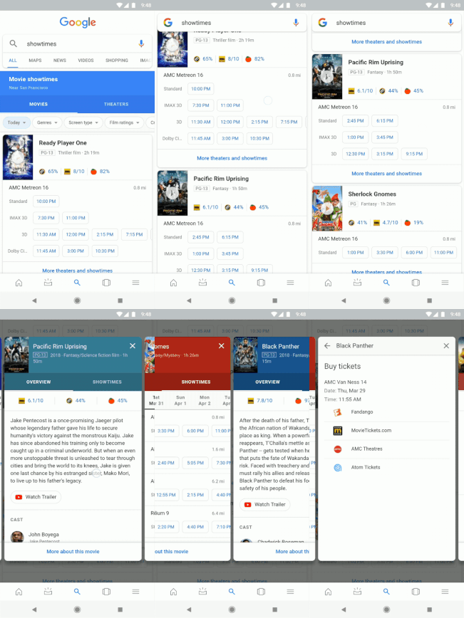
For both movies and TV shows, the cards have changed as we’ve detailed in our previous article, with dedicated tabs to quickly jump to reviews, news, and trailers and clips. The movie showtime carousel has also been revamped, as reported by 9to5Google, with the new pastel headers being the most prominent difference.


Left: Old movie showtime cards (credit). Middle & Right: New.
The more important addition though is in the People also search for tab. Previously, a small carousel would appear on the bottom of the search result card, and it mixed all kinds of recommendations together. Now, the similar searches are grouped thematically in sub-tabs.
For example, searches related to Avengers include Captain America movies, those based on stories by Stan Lee, and superhero films. If you look for Stranger Things, you can see other TV series or only those by Netflix. And when searching for Assassin’s Creed games, you’ll get similar results in the AC franchise or other role-playing titles.


New sub-categories for similar searches in Movies (left), TV series (middle), and games (right).
When looking for books, the new search card adds a few useful tabs. There’s one with links to purchase the book at various online retailers, and another with big cards for every other book written by the same author, including publication date and a small synopsis.


Left: Old book search result. Middle & Right: New “get book” and “more by author.”
Music: Band members
Save for the new card design look, there isn’t a lot of change for music artists. The only notable difference is the addition of a members tab for bands, with large thumbnails of each person. Instead of only seeing the names, previously, you now get a better understanding of who is who in the band.


Left: Old band search card. Middle & Right: New with band members tab.
Also worth mentioning for music is that song cards have a separate tab for lyrics now. The words are still below the main result card, but there’s also a standalone tab for them. Redundancy.


Left: Old song search card. Right: New with standalone lyrics tab.
Fictional characters: Played by, movies, pertinent details
Moving on to fictional characters, the new card has a lot of additions. Most prominent is the Played by tab that shows all the actors that have taken on that role in movies and TV shows. But there is also a tab for those films and series where the character appeared.
You’ll also notice on the main details card a few added pertinent details. Here are some examples:
- Winnie the Pooh: personality traits and home
- Aragorn: species, organizations, and weapons
- Wonder Woman: place of origin, first appearance in the comics, significant others, and universe she belongs to
- Hercules: place of birth and death, children.


Left: Old fictional card search result. Middle & Right: New card with more details and actors.
Famous people
Writers: Books, stories, poems (finally)
This one is a little ridiculous. The previous search card for novelists, writers, comic book artists, and poets used to have a tab for quotes and movies, but none for their actual published works. Now, you’ll get a dedicated tab for books, and depending on the type of writer, you may also see a tab for short stories or poems.


Left: Old novelist search card. Middle: New tabs for books, stories. Right: Poems tab.
Artists: Art periods
When looking for an artist, the new card has a new tab for the art period they fit in. The info was available before in the main card, but you get large and pretty thumbnails now. That should simplify the terms for those of us who can’t tell their Expressionism from their Surrealism.


Left: Old artist search result. Middle & Right: New card with dedicated Periods tab.
Celebrities: Quotes, books, movies
The celebrities that don’t fit in the categories discussed earlier have also received a revamp to their search card. The biggest change is the addition of tabs for quotes, books written by them (if applicable), plus movies and videos they’ve appeared in.


New celebrity cards with tabs for quotes, movies/videos, books, news, and more.
It’s funny to note though that results aren’t consistent across the board for the same type of celebrity. Take politicians for example, and you’ll see that Putin gets both news and quotes tabs, whereas Trump doesn’t have a quotes tab, and Merkel has no news tab. Make of that what you will…


Tabs in politician search results aren’t very consistent. No comment.
Food ingredients: Top recipes
When looking up ingredients like fruits and veggies, animal products, or dairy, you’ll find a new recipes tab. It offers several meal ideas along with filters to narrow down the suggestions. That may help you get an idea of how an obscure ingredient is used and what it can be mixed with.


Left: Old search card for food items. Middle & Right: New card with recipes tab and filters.
Others: Nothing really new
I spent a bit of time looking at other types of searches to try to trigger the new card look, but mostly came back with the older design, or the new one without any significant changes. Just like with the term “Android” below, the biggest difference seems to be the new header color and a tabbed layout for already-existing data: breeds for animals, classification for plants, compositions for (erm) composers, structures for architects, etc…


Left: Old search result card for Android. Right: New.
For everything else, from plays to novel series, sports events and teams, companies, diseases, and more, the search result card hasn’t been changed at all. You even get the bold header sometimes, and the left-aligned Follow button, indicating that these cards haven’t been revamped yet.


Other search terms bring up the older search cards still.
Server-side change
As we’ve become accustomed to, this is a server-side change. Some of you may have already begun seeing these new cards when we talked about them in December, others may not have most of them yet. I say “most” because the new weather card and movie/TV series layout (plus showtimes) appear to have rolled out to everyone. I can see them on older devices that haven’t been updated in months and that still have the previous design for all other search results.
Having a specific version of the Google app doesn’t seem to influence the presence of these cards, but you can always make sure you’ve got the latest one just in case. Here it is: v9.66.5 at APK Mirror.


